M5 Forecasting Accuracy - Start Blog
This kaggle competition asks participants to estimate, as precisely as possible, the point forecasts of the unit sales of various products sold in the USA by Walmart.
How much camping gear will one store sell each month in a year? To the uninitiated, calculating sales at this level may seem as difficult as predicting the weather. Both types of forecasting rely on science and historical data. While a wrong weather forecast may result in you carrying around an umbrella on a sunny day, inaccurate business forecasts could result in actual or opportunity losses. In this competition, in addition to traditional forecasting methods you’re also challenged to use machine learning to improve forecast accuracy.
This competition is the fifth iteration of its kind in which hierarchical sales data from Walmart will be used to forecast the sales for the next 28 consecutive days. This blog gives an overview of the competition. The data set and competition metric will be discussed.
Data set
Files
-
calendar.csv- Contains information about the dates on which the products are sold. -
sales_train_validation.csv- Contains the historical daily unit sales data per product and store [d_1 - d_1913] -
sample_submission.csv- The correct format for submissions. -
sell_prices.csv- Contains information about the price of the products sold per store and date.
Data format
The historic data has the format shown below. Each row represents the sale history of an item across 1913 days. The id tells us the item type, state and store. No explicit item information is provided. The historical data range from 2011-01-29 to 2016-06-19.

Submission format
It requires us to extract patterns in the previous 1913 days and predict the point sales in the next 56 days. The first 28 days represent validation rows which participants are required to predict in state I and the ground truth will be offered. The prediction for the last 28 days will be used as the test data for final competition standings.
The submission example file looks like

Evaluation metrics
For each series of the same item, a Root Mean Squared Scaled Error (RMSSE) is calculated. It reads as:
\[\begin{align*} RMSSE = \sqrt{\frac{1}{h} \frac{\sum_{t=n+1}^{n+h} (Y_t - \widehat{Y_t})}{\frac{1}{n-1} \sum_{t=2}^{n} (Y_t - Y_{t-1})}} \end{align*}\]The choice of the measure is justified in the competitors guide, saying that rather than using absolut errors optimized for median, squared errors are more suitable for the mean. Also, the measure is scale independent and it can be used to compare series with different scales. The metric is symmetric because it equally penalize positive and negative errors, as well as small and large forecasts.
With the RMSSE for all time series, the final error is ranked using the Weighted RMSSE (WRMSSE), as described below:
\[\begin{align*} WRMSSE = \sum_{t=1}^{N} w_i \times RMSSE_i \end{align*}\]A pytorch implementation of the WRMSSE designed for this competition is detailed in the notebook by Chris Miles.
Exploratory data analysis (EDA)
A Trick: When you plot with matplotlib, you can define colors to use using color_cycle = cycle(plt.rcParams['axes.prop_cycle'].by_key()['color']).
The EDA figures were generated with methods heavily adapted from the notebook copied from Rob Mulla.
A view into a single item time series
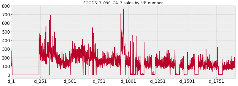
For example, the item ‘FOODS_3_090_CA_3_validation’ seems to be sold a lot historically. Note that there are days when it appears the item is not available and not sold due to special events, corresponding to the flat lines in the below plot. Also we can see in a certain period, spikes may come up.

Counts of item by types
Number of items by Category shows that FOODS account for the majority of the items, followed by HOUSEHOLDS and then HOBBIES items.

Rollout of sold items
Sales by store
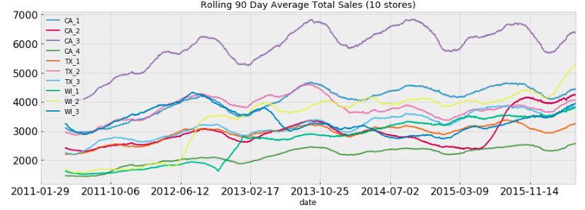
In total there are 10 unique stores, we would like to find the sales patterns for each store. Results shown below indicate that some stores (e.g. CA_3 and CA_1) show more steady patterns than other stores (e.g. WI_1 and WI_2). The abrupt changes may be attributed to the shortage in supply chains or the rise of new competitors.

Sales heatmap calendar
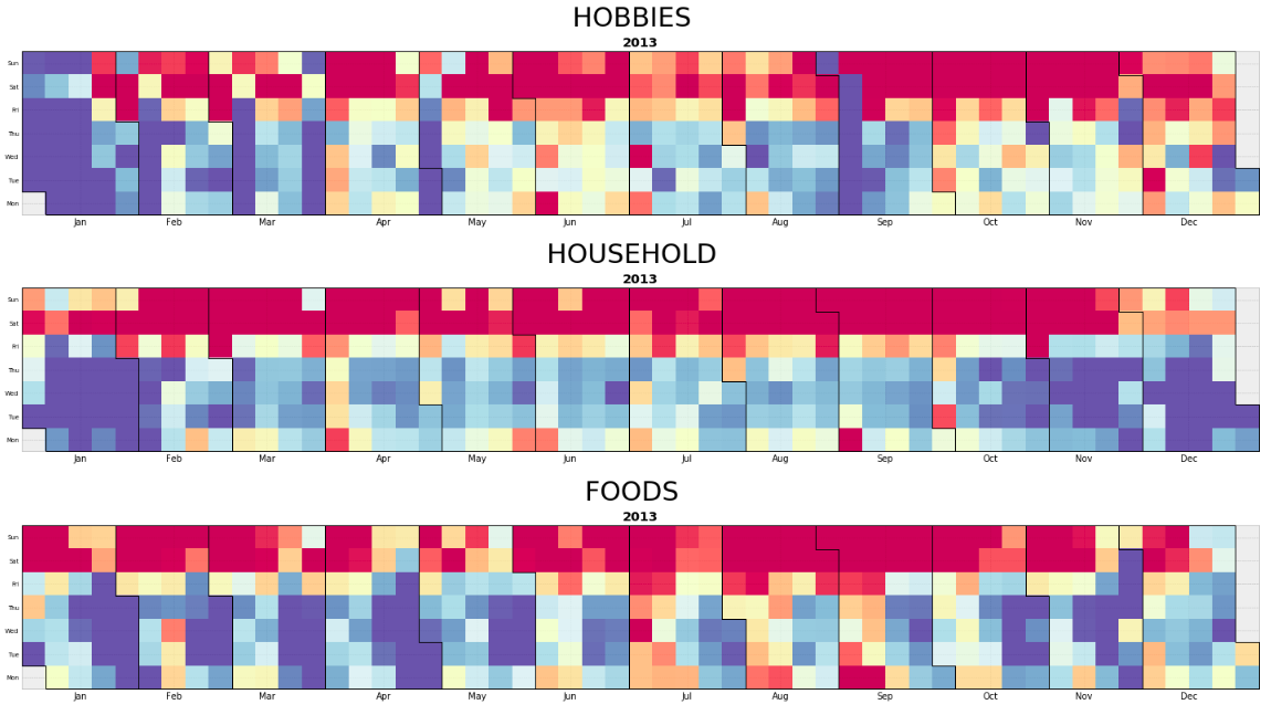
Using the method by Nicolas P. Rougier, we plot out the heatmap calendar for sales of each type of items. Some observations from the heatmap are:
- Food tends to have lower number of purchases at the end of each month
- Household and Hobby items sell much less in January.
- Weekends are more popular shopping days regardless of the item types.

Sale prices
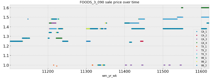
Sale prices over time for each store indicate a gradual increase of prices.

In summary, the sale prices at different hierarchical levels may display different patterns. It looks like aggregated levels tend to show more clear patterns than granular levels. Also, special patterns such as flat lines and spikes exist across different items, implying the importance of understanding exogenous/explanatory variables.